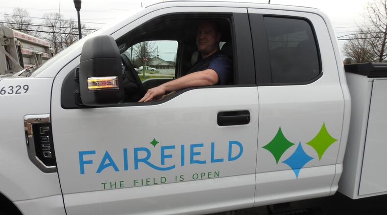
The city contracted the consulting firm BLDG to develop a comprehensive brand identity for the city, and short term and long term roll-out plans. It’s projected to cost the city $30,000 to roll out the new brand in its first year. The goal for the new logo is to create consistency among the departments.
LOCAL NEWS: Fairfield, Butler County officials address the decision to close elementary school Wednesday
The tag line is a culmination of a number of things, said Fairfield Communications Manager Jenny Dexter.
“The Field is a unifying term,” she said, just as people think of the Cincinnati Bengals when they say “Who Dey,” or New York City when they say “the Big Apple.” “The Field has the potential to be that for Fairfield in a huge way.”
“Open” in the tag line represents “a state of mind,” Dexter said. “We’re open to everyone.”
Dexter also said “The Field is Open,” which she called a “causal reference” to the city, “is a rallying cry for loyal people.”
The logo also comes with a new color scheme — a light shade of blue and green — where the city’s name is written in a flowing sans serif font. A two-dimensional diamond, being described as a beacon, is positioned between the “R” and “F” of Fairfield. Departments will have their own diamond-topped Fairfield logo but with varying colors of the diamond and department name underneath the city’s name. There are also logos where Ohio and the four seasons are underneath.
Branding of city departments historically has been a hodgepodge of fonts, colors and naming conventions, City Manager Mark Wendling said.
“If you look at parks and rec’s logo, it never says the city of Fairfield,” he said. “It just says Fairfield Parks and Recreation. You would not necessarily know it’s a city department. That’s something we feel is very important, that when you look at it, that you know it is a Fairfield city agency or department.”
Banners around the city will be unveiled this week.
The city’s seal, which was created in 1963 by the late Ted Hershner, will remain the city’s historic and legal seal, said City Manager Mark Wendling.
“(The city seal) is very important to us,” he said, “but we’ve never really had something we could use for marketing in really promoting the city.”
The full roll out of the new logo initiative will take three to five years, city officials said. Letterhead and vehicles will get the updated logo when they need to be replaced, and Assistant City Manager Dan Wendt said there are not plans at the moment to update signs, but indicated retrofitting of the logo could be placed on monument signs.
“We tried to be mindful of the cost as we rolled it out,” said Dexter.
About the Author

